
The first checkout screen is for an AirBnB style website. For these websites, I think it's important to be very clear on what you're being charged for. The left side states how many nights the user is staying, the amount of space they are getting, and when they are booking. The right side restates nights staying and prices in hopes this would limit confusion for the customer.
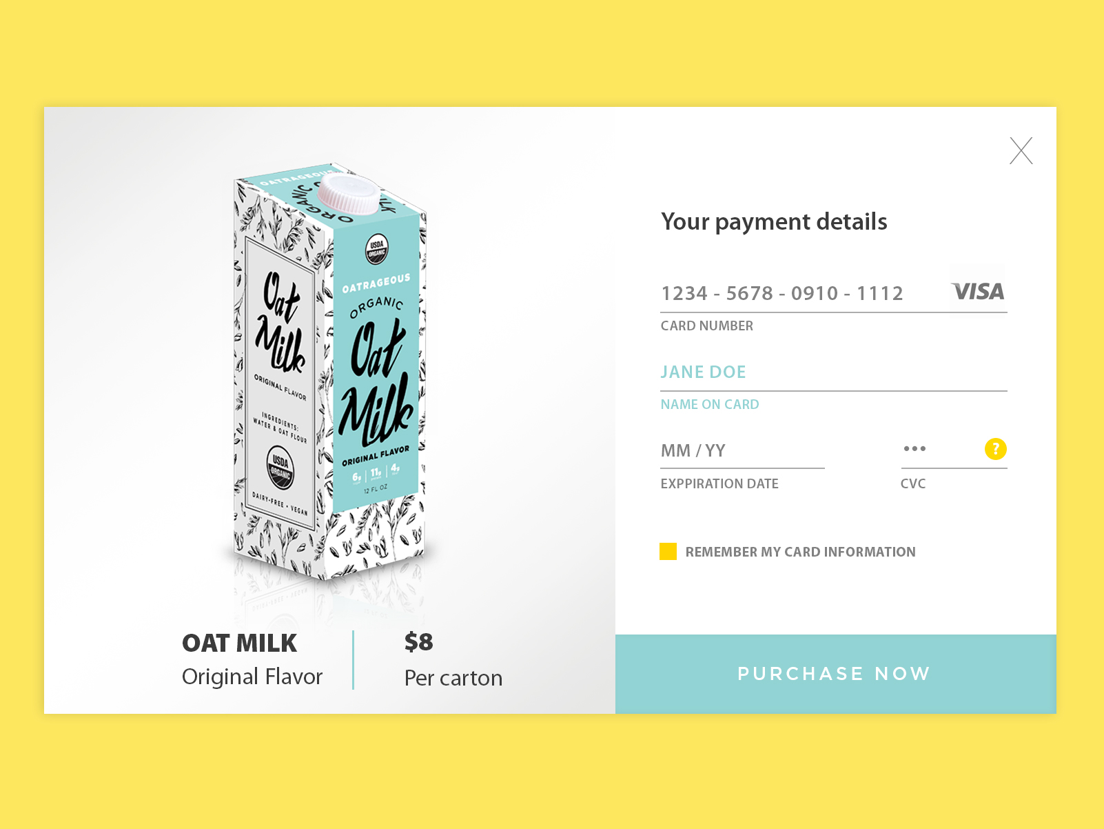
This is a checkout screen for Oatrageous Oat Milk, a package design option for a previous project. I wanted the payment to be simple, clear, and to the point reflecting what is shown in the package design.